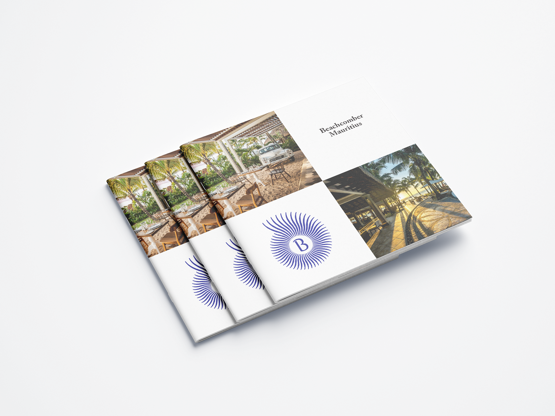
Front Cover
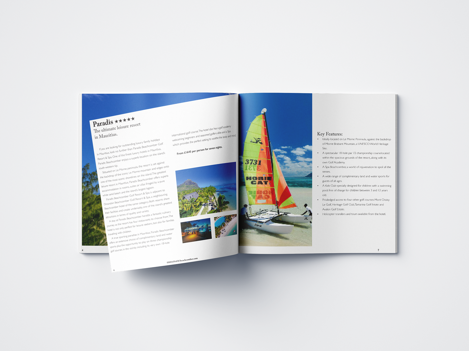
Pages 6 and 7
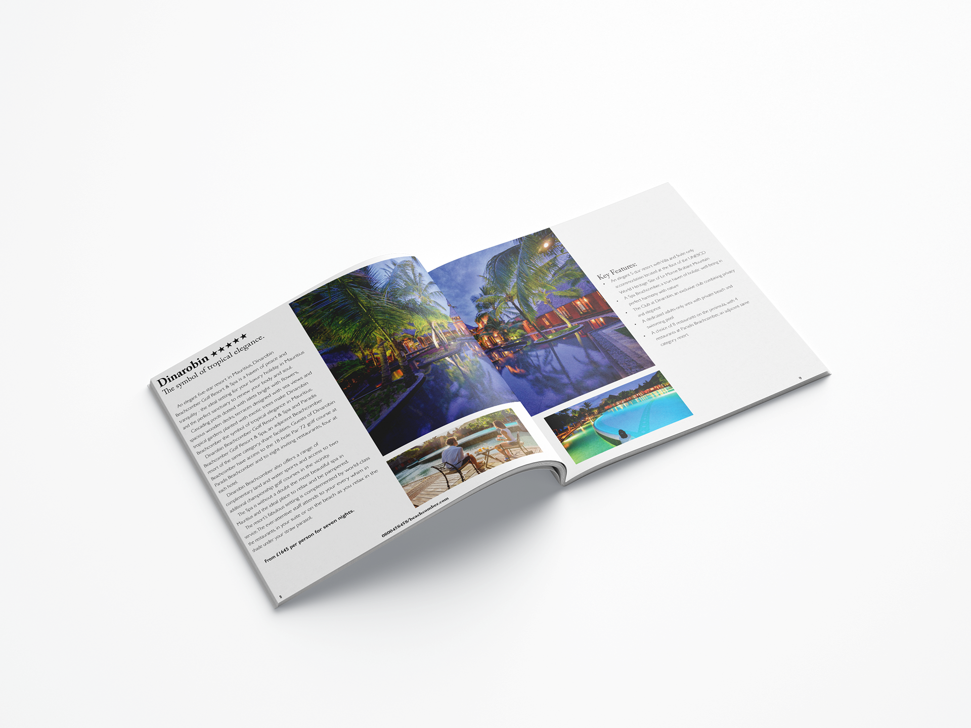
Pages 8 and 9
Why did I do this?
I did this because it one of my units for my year one course at Boston College. The breif was simple in that you had to make a brochure for this company. I started off by doing researching into other brochures and how they layed everything out on the page and then I looked into the images that I would be using and then took it into InDesign and made my brochure there.
What do I like about it?
- I like how organised it is, and how the images on each pages look like each other in a way that they all seem to be the same like pool picture, night time pictures ect...
- I also really like the typeface Iused because it ts well in witheverything and it doesn’t look out of place like sometimes things like that can look.
What don’t I like about it?
- I don’t like that I didn’t have any colour on the important bits like some brochures have.
- I don’t feel 100% about my front page either, I feel like theres something missing or I could of used less images.
- I don’t feel 100% about my front page either, I feel like theres something missing or I could of used less images.
Improvements?
- I think I could/would of chosen a colour to represent this company or even use the blue like on the logo for the important parts and use that to highlight key things.
- I would of put some icons in like for number or anything like that to make it look less wordy.
- For the front cover I think I would just of put one single photo on that I really liked overall and then had the name of the brochure
- For the front cover I think I would just of put one single photo on that I really liked overall and then had the name of the brochure
in white over the top so then it stood out even more, I don’t think I would have the logo on the front page as I have it on the page after and I think it just doesnt look right.