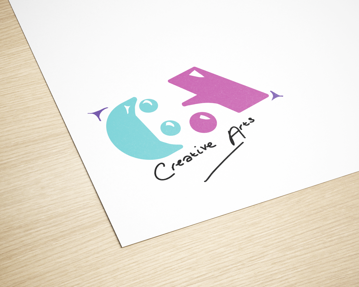
Why did I do this?
This was my first brief at Boston College when I started in September 2017 for my first year. This was also my first LIVE brief which was in fact for Boston College itself and we were re-marketing a department (well, combining two departments into one).
What do I like about this?
- I really like how it came out because it looks cute and to the point so you know what it is, so it is easy to understand.
- I really like my handwriting the "creative arts" at the bottom of my logo because it gives it a little something else by putting a more personal touch to it.
What don't I like about it?
- I don't like the Boston College logo either side of my "CA" part aren't looking too brilliant and it looks rushed and doesn't actually look like the actual Boston College logo also it is the wrong colour.
- The curve on the "C" isn't the greatest either so it doesn't look as straight as it should look and doesn't carry on with the flow.
- The white on the inside of the "CA" aren't the best either because they don't slow was well and they just look like they were placed there but they should look like they are there for a reason.
Improvements?
- I would make sure the letters flow better and not just look like it's all been rushed to complete because it looks like I didn't have enough time.
- Change the Boston College logo colour to lime green like it is already, and I would change the way they look and so then they look better and more like triangles.