Why did I make this?
We had to chose a typeface and research into that typeface and make a poster about it so I chose to do Gills Sans which I found to be a very interesting, especially when looking into the creator of Gill Sans, Eric Gill.
What do I like about this?
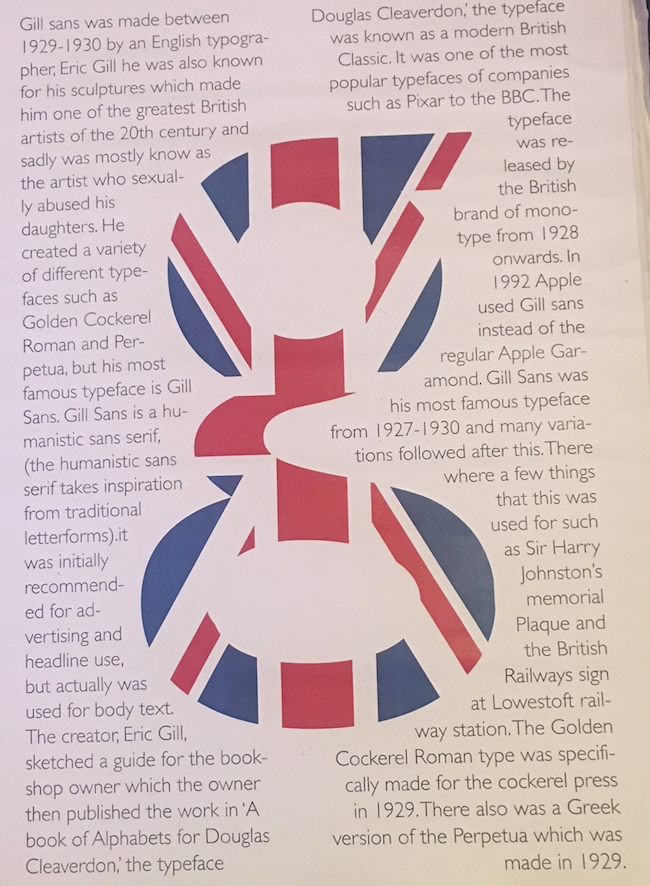
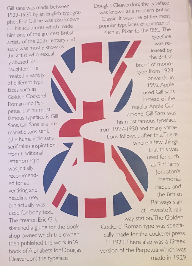
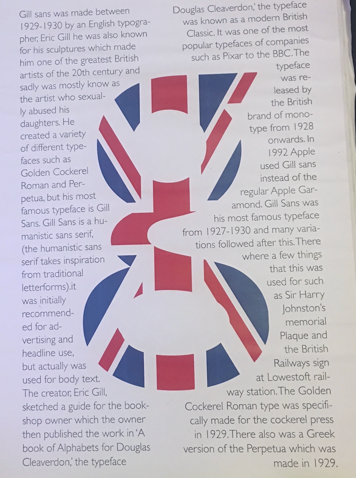
- I really like the 'g' in the middle, as it is known as his best design was the 'g' he designed and that he was English and was known to be used for the underground and that is why I used the UK flag in the 'g'.
- I really like how the text wraps around the 'g' as well I think it looks better like that because if I overlapped, I don't think it would of looked nice and possibly you wouldn't be able to read it.
- I really like how it is unique and not many people have done a design like this before so it catches peoples eyes.
What don't I like about this?
- I don't like how it is just a burst of information and nothing really stands out about the information like I think I should of put the most important information bigger than the less important information.
Improvements?
- I would put the most important information in bold and bigger than the rest.