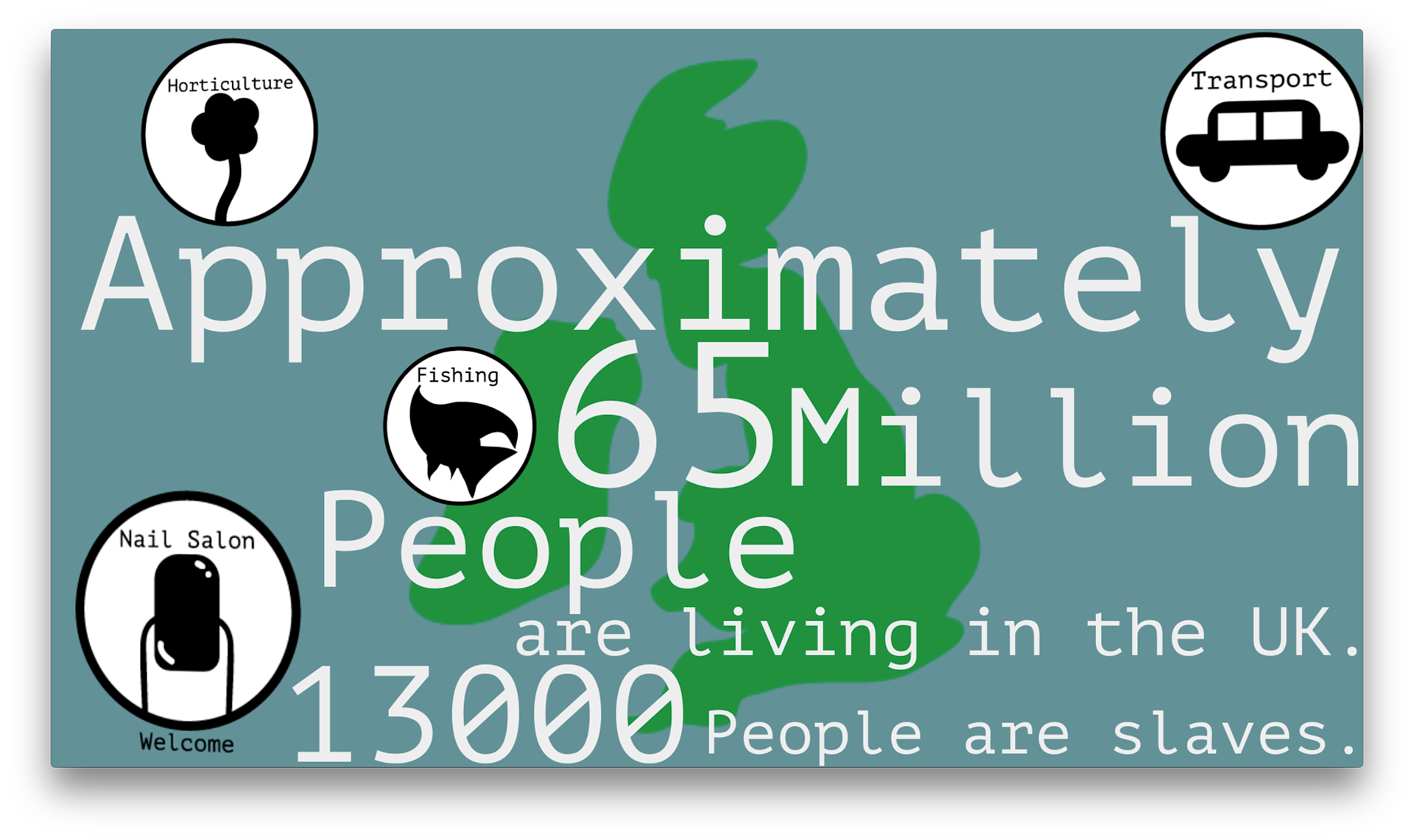
The UK
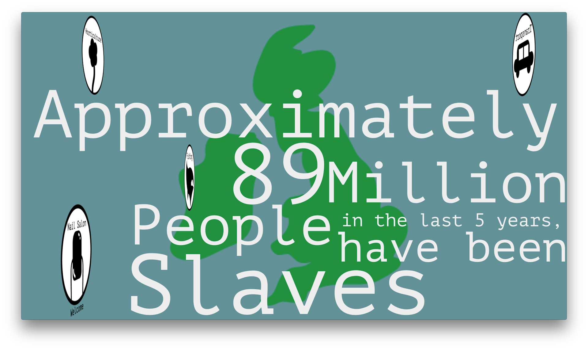
Around the world
(these are just screenshots the video will be posted on youtube and I will attach the link to this when it has been uploaded).
Why did I do this?
I did this because we had a project with the GLAA at college where we had to make an infographic video on Modern Day Slavery and I did it on how to spot the signs and I put in how many people are slaves in the UK and how many people are slaves in the world over the past 5 years (this also was a group project at college which I did by myself).
What do I like about this?
- I like this because I think it gives kids a fun and enjoyable video to watch (because my target audience was children) and I think it goes well with my target audience.
- I also like it because it is unique and different to everyone else's designs and work that they did for the GLAA.
- I really like my drawing of the UK in the background of these images because you know when you see it that it is the UK.
- I also think my infographic icon/logos are really strong and you know what they are so if you look at them you know what you are talking about.
What don't I like about this?
- I don't like how that the infographics are just there and not used for anything really they're just there with no explanation.
- I don't like some of my transactions I think some of them could be a little smoother than they are in the video.
Improvements?
- I would zoom out of the UK in the "around the world" information to some of the other countries drawn as well and not just the UK because it is meant to be around the world and not just in the UK.
- I would change the transactions so they were more smoother and more like it's a real thing than something that I've just put together.