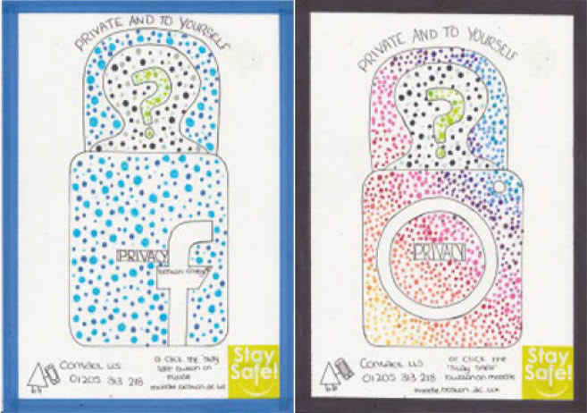
Why did I make this?
I made this at College for a unit I did on my Year One course at Boston College, we was asked to make a poster about Internet Safety to place around college. Mine was about being safe online and only to add people you know onto your social media. I got the dot design from looking through Instagram at Harry Potter design posters/drawings.
What do I like about it?
- I really like how it looks with the dots and how all the colours match to to the icons/logos of the actual social media (so for example the blue for the blue Facebook icon).
- I also really like that I did a boarder around them all and made sure that the boarder was the same measurements all the way round.
What don't I like about it?
- I don't like that I did it by hand anymore because I now feel like I wasted my time doing it by hand because it would of been much easier to do with illustrator instead of having to re-drew the whole thing like 20 times a day.
- I also really don't like that I wrote it out because my handwriting was really horrible and it didn't work well with the poster.
Improvements?
- I will try and do the same design but on the computer instead of being hand drawn.
- Next time I would add more dots in the Facebook poster to match the Instagram poster or I would do less dots on the Instagram poster to match Facebooks Poster.