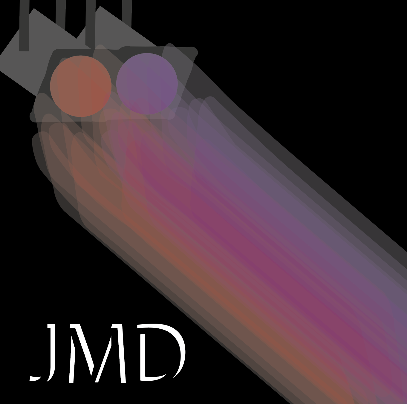
Logo
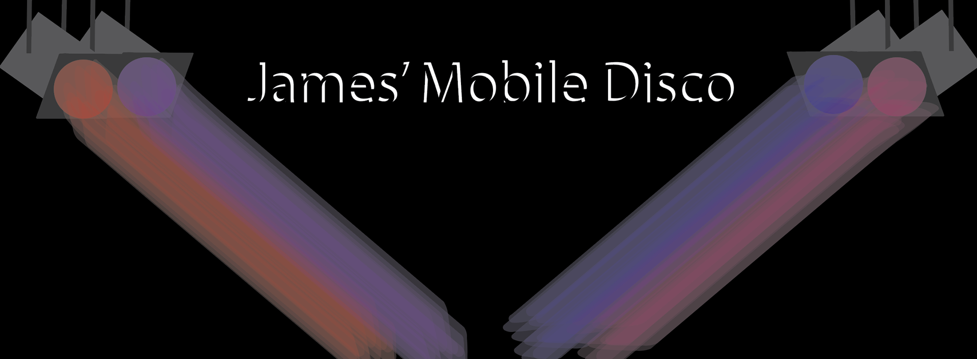
Cover Photo
Why did I do this?
I was asked by James to make a logo and a Cover photo for him for his 'mobile disco' business so I made lots of different designs but these were my favourite.
What do I like about this?
- I like how it all goes together and it all has something to do with a disco, so like the black background because they turn the lights off, so it's dark, and then the lights are the lights they use for discos.
- I really like how it is very easy to understand and I like the typeface used.
What don't I like about this?
- I'm not too sure about the lights on the Logo because it just doesn't look as good as it does on the cover, possibly could make them thinner to work better.
Improvements?
- I might try and see if I can sort out the thickness of the lights in the logo design to be thinner.
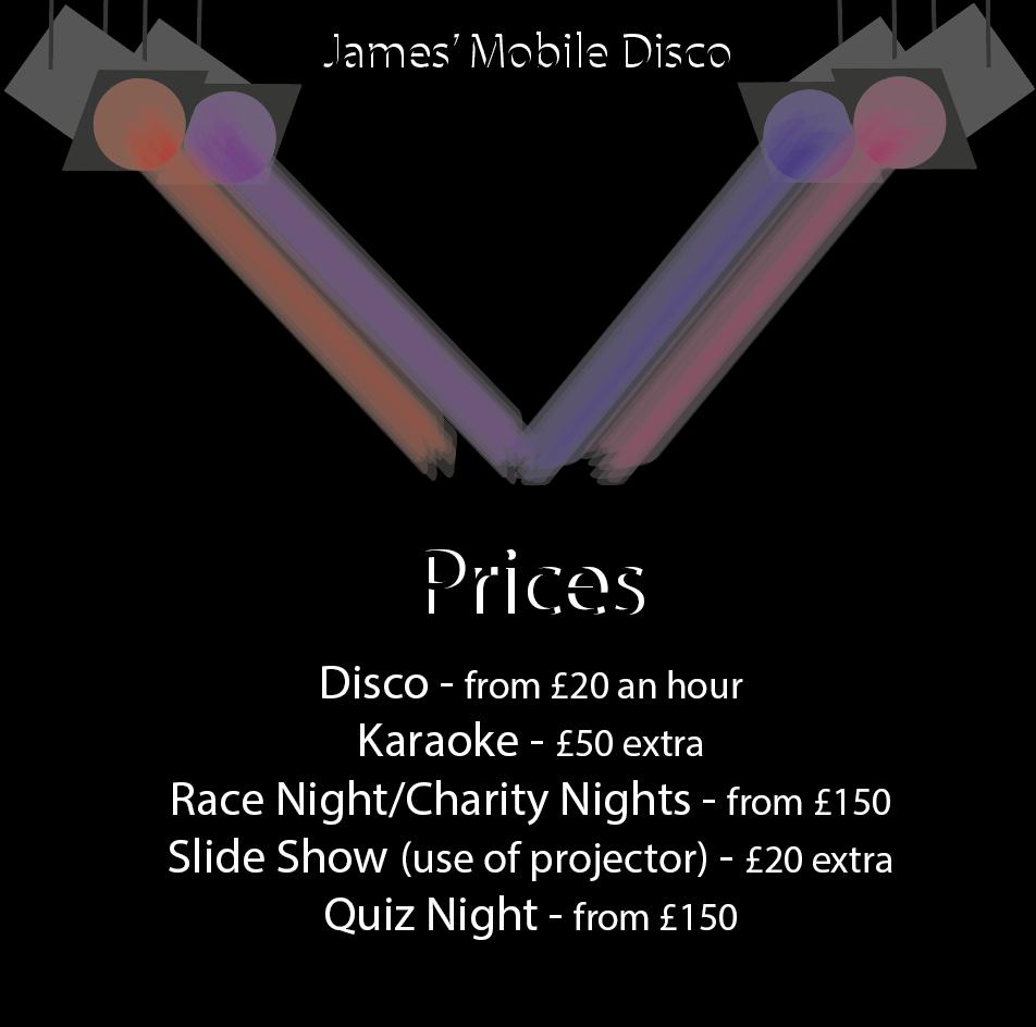
Why did I do this?
I was asked by James to do a price list for him so he can remember and sort out how much everything will cost when people ask what they want doing.
What do I like about this?
- I like how I used the logo/cover photo at the top of the page so then it is easily recognised as James' Mobile Disco.
- I like the typeface used because it is simple and not too hard to read.
- I really like the dark background as well because I think it makes the whole thing stand out more.
What don't I like about this?
- I'm not sure about the actual lights on this, as they don't have any boarders around and they look joint together which doesn't look the greatest.
Improvements?
- I might add back/white boarders around the lights to make them look individual than joint together.