Why did I do this?
I made this CV for a friend of a friend because he wanted to get an apprenticeship for next year and he needed a CV designing to make it look more professional ( the blank part under his name is his contact information and contact details which I didn't want to upload).
What do I like about it?
- I like how simple and to the point it is and that there isn't too much on the page, so there isn't an overload of information.
- I like the bold name at the top because it does actually look like someone has handwritten it onto the page.
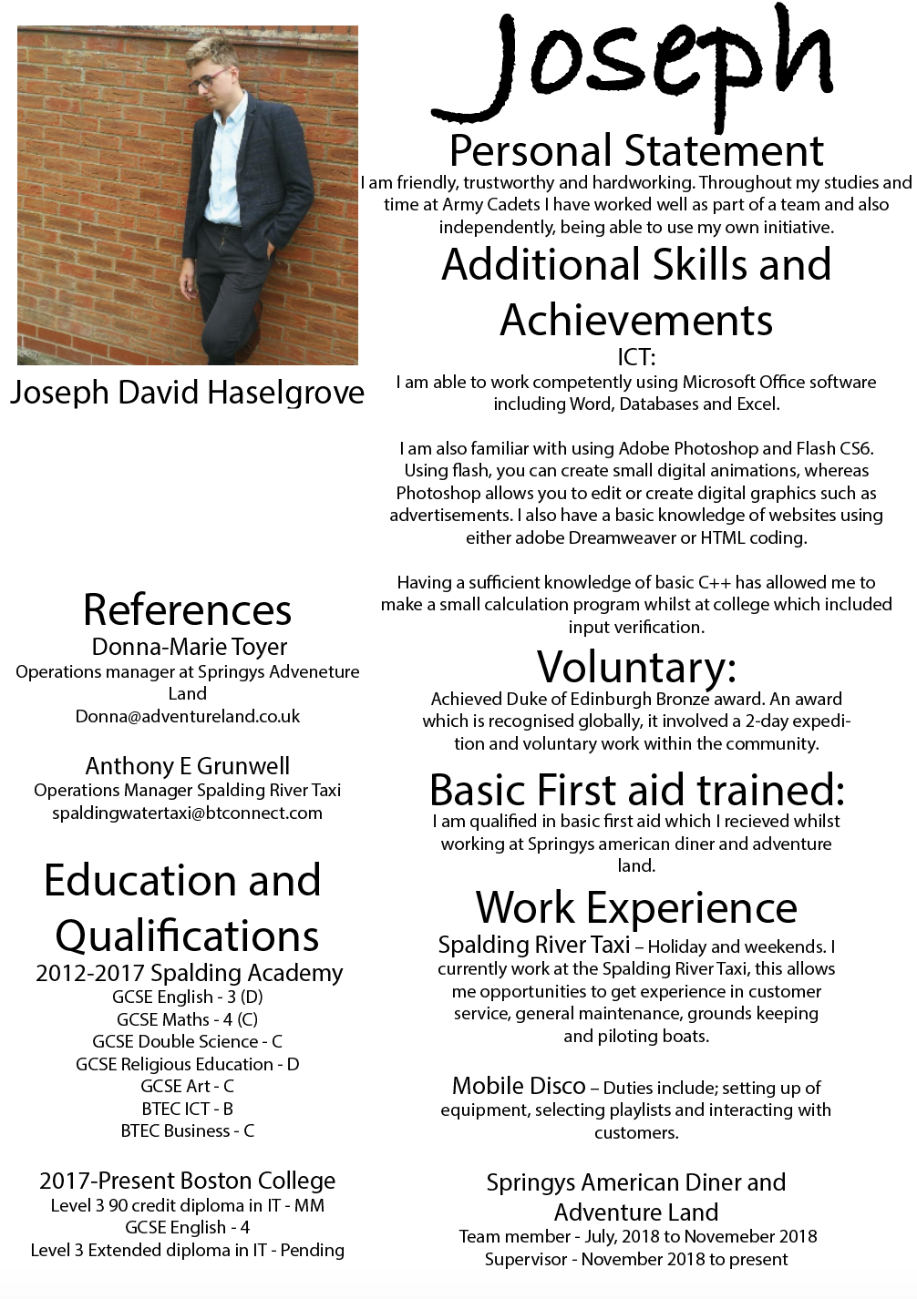
What don't I like about it?
- I don't like the unprofessional photo that I used but I had no other photo of him.
Improvements?
- I think I would change the image that is used of him and try and have a more professional image.
- I would want to add some icons so it looked more outgoing but still keep it simple at the same time.