Why did I do this?
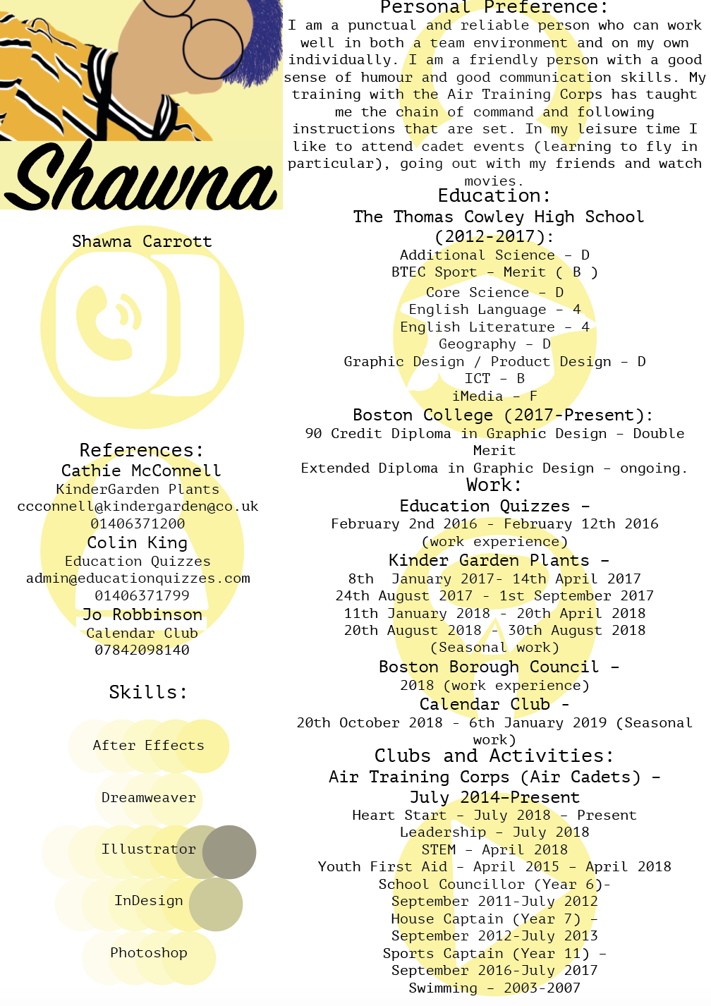
In my year 2 Graphic Design course at Boston College, I did an information graphic brief which I did many workshops with information graphics and my favourite one of them all was this CV I made with the different information graphics that I created. I also made sure all the colours matched (the blank space under my name is where my contact details where but I didn't want them on here.
What do I like about this?
- I really like this because of the fact the colours match and how it all looks together and that it all goes well together.
- I really like my typeface I used and how well it all works well together.
- I like how both my CV's look similar but are for different things.
What don't I like about this?
- I don't like the image that is used because I don't think there is enough detail to it like some of the other photos I've done but I do think it works well colour wise.
- I don't like the the school/education icon that I used because it just looks rushed and not well thought of.
Improvements?
- I think I might redo the Education/School icon so it looks more professional and so it doesn't look rushed.
- I might try and look at using different images.