Why did I do this?
I did this because my auntie is holding a Race Night for her football team and needed raffle prises for a raffle she is holding during the night, so I said I'd do a personalised drawing of a photo of their choice as a prise.
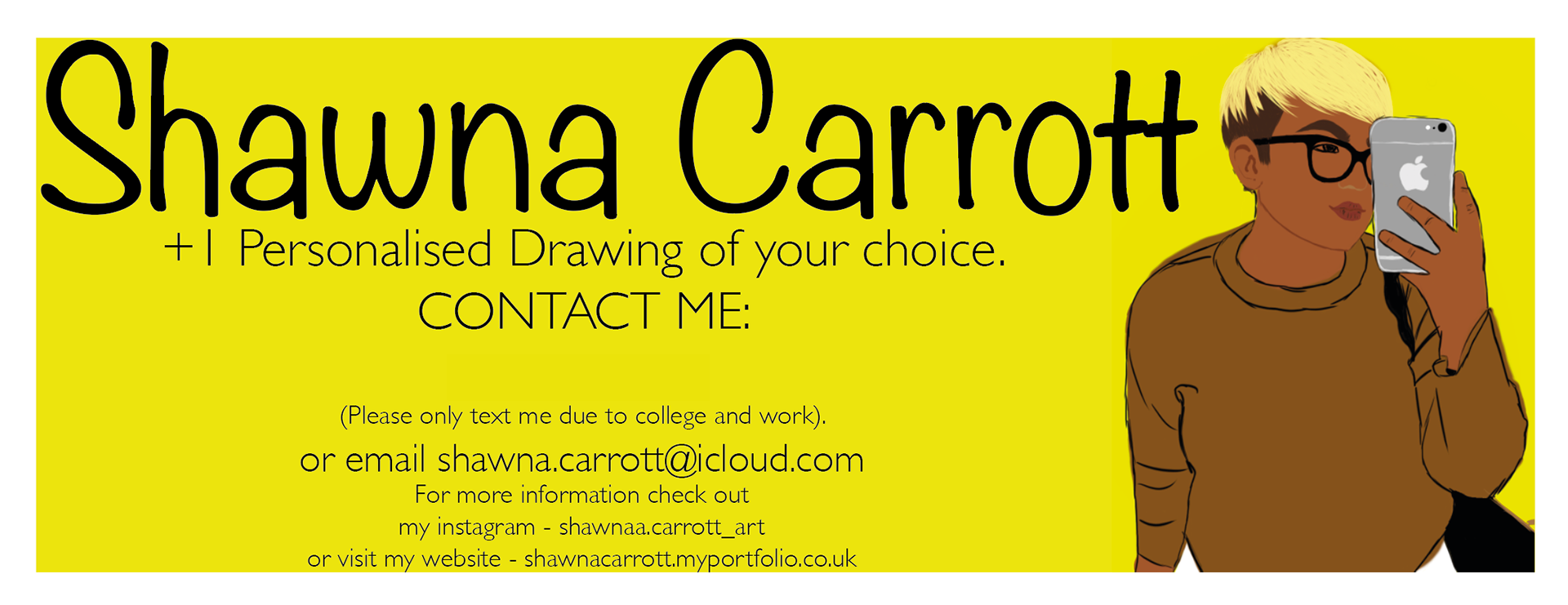
What do I like about this?
- I really like the background and how the yellow really represents me and my favourite colour.
- I really like the photo I chose as in the image on the side because I think it is one of my strongest drawings that I have done.
- I like how I put all my information at the bottom and how it is all laid out on the page with the most important information in bold and the less important information in a smaller typeface.
What don't I like about this?
- I really don't like the typeface as my name on the top because it doesn't look right and look like me.
- I don't really like how the "or email" bit is the same size as "shawna.carrott@icloud.com" because I think it would look better if the "or email" bit was a little smaller than the "shawna.carrott@icloud.com" bit.
- I don't like how it just had a white boarder and it doesn't look right I think it needs a black boarder around the white boarder.
Improvements?
- I think I would put in the black boarder as well as the white boarder so then it stands out more.
- I would change the size of the "or email" bit smaller than my email address so then the email address stands out more.
- I want to change the typeface for my name so then it looks more me and goes with the rest of the image/ticket.