Why did I do this?
I did this because I needed a logo for my YouTube channel I have to upload videos of my design work like the GLAA video and my title sequence I made with College.
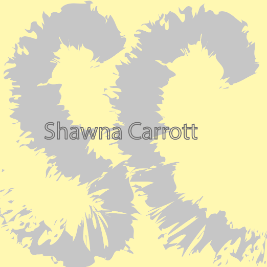
What do I like about this?
- I really like the colours used the baby yellow and the light grey really works well together and makes it look cute.
- I really like the brush stroke used for the "SC" because it looks like an actual brush and not just a random line used.
- I really like the typeface used for the "Shawna Carrott" bit as well, I like the fact it's just an outline and not actually a solid colour.
What don't I like about this?
- I don't like how rushed it looks and how it doesn't look professional enough to be something good.
Improvements?
- I would redo it and try and make it look less rushed and more professional and more like someone has taken a lot of time to do this.