Home
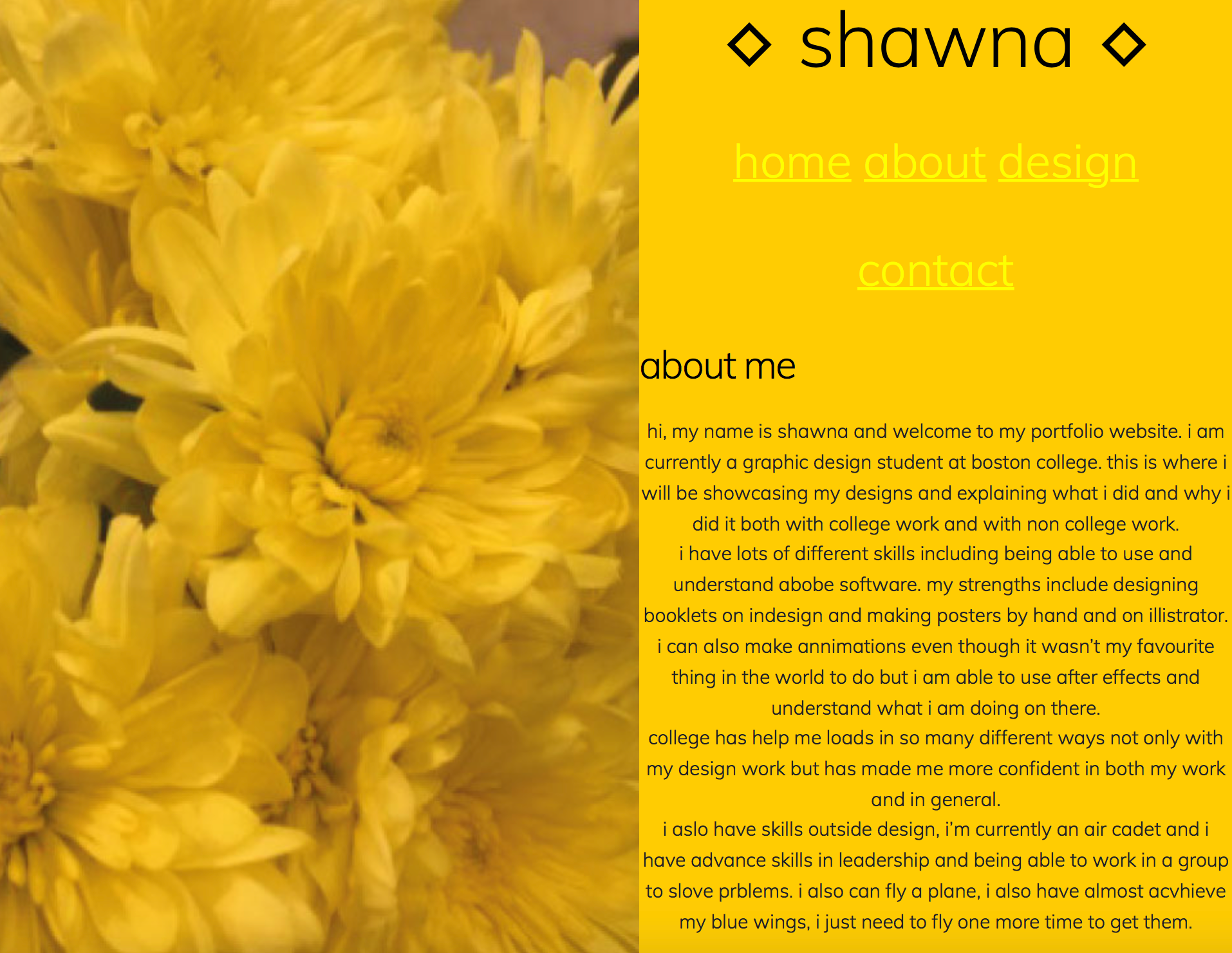
About Me
Design
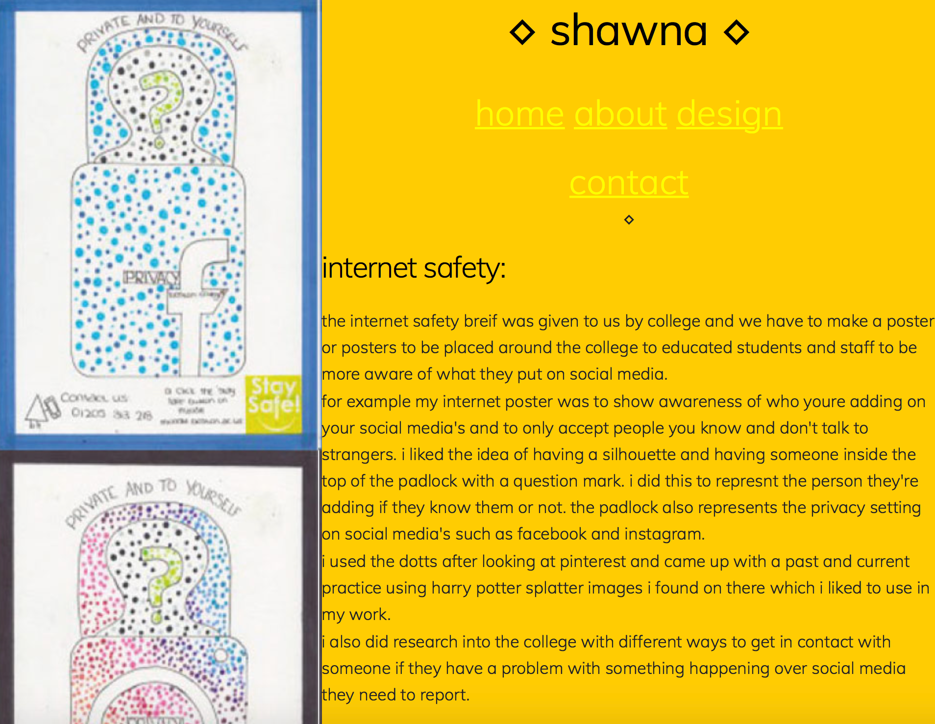
Internet Safety
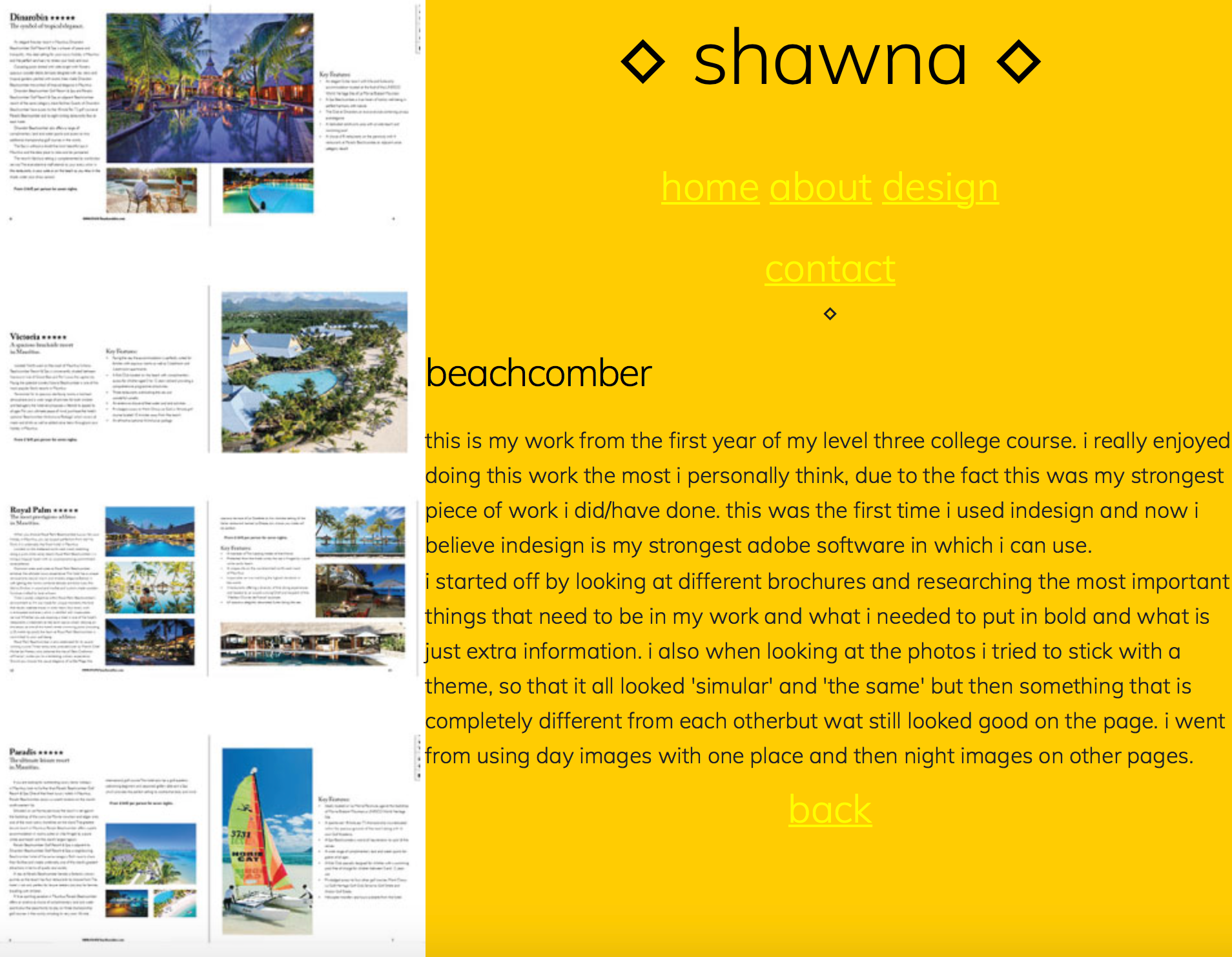
Beachcomber
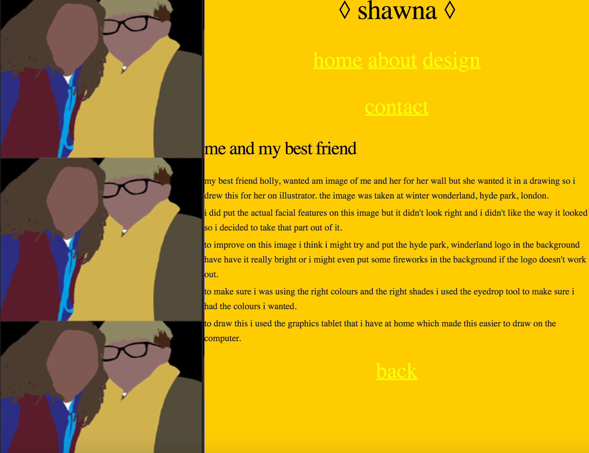
Me and Holly
Contact
Why did I do this?
I made this website portfolio for a unit in my second year of college at Boston where we had to code a website and make it our own.
Why do I like this?
- I really like this because of the colours and the images used because the colours match and the measurements all match up with each other.
- I really like the diamond used because it just gives my design a little something else to go in with the design.
Why don't I like this?
- I don't like that I used only lowercase letter thinking it looked cute when it looks really horrible and like I can't do anything properly.
- I don't like how on some of my pages the "contact" navigation is on the same line as the others but on the line below on the other pages.
- I don't like on the "me and my best friend" page it has a different typeface than the others which doesn't look nice at all.
Improvements?
- I would change the typeface on the "me and my best friend" page to match the rest of the typefaces to make it more professional.
- I would put in all capital letters to make it look like an adult had done it and not a child who didn't know what they were talking about or doing.
- I would also make sure that the navigation buttons are all where they are meant to be and not in different places so it looks all the same.